I had spent a very enjoyable time at Tempsford Stained Glass and had finally settled upon two pieces of glass.
Sorted then. Well... no. There were still decisions to be made. There were also the parameters that I had set myself for the design.
I wanted the colours and 'waves' in the glass to flow naturally in the finished piece. I needed to decide which part of the glass would best suit the flow of lines in my design. Youghiogheny glass has a waxy appearance. The part of the glass with the most waxy appearance was that part devoid of colour. I also wanted to make the most of the most dramatic part of the glass. There would be no margins for error.
Also to consider was the texture of the glass. I want the finished design to be highly tactile. The texture on the reverse of the Youghiogheny glass was really interesting. However, the colours on the reverse were less vibrant. I needed to think carefully. Working on the reverse would have an implication for placement of the pattern pieces. In addition, I also needed to consider how I was going to use my Uruboros glass. The ripple backed glass was not going to be an easy cutting option. I had bought a larger piece of glass than I needed to take account of cutting errors. I still wanted the gradation of colour to appear natural in the shapes that I had highlighted for the second piece of glass. I spent a considerable amount of time with the glass and cartoon just exploring the options. Eventually the plan became clear.
Friday, 23 October 2009
Tuesday, 20 October 2009
Glass
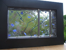
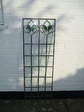
The choice of glass for my new project is crucial. It will not be back lit as it's to be mounted in a frame to hang on a wall. Clearly, the glass that I use has to be of an opaque nature, with interesting patterning within the glass. Texture should also play an important part.
It was with this in mind that I visited my favourite stained glass supplier at Tempsford. I had thought originally that I might use a very dark black baroque glass with a vibrant red glass as a contrast. It would make a mark and stand out from the crowd.
Baroque glass has the advantage of being textured in a swirly wave kind of way. The sort of glass that you would be tempted to touch and run your fingers over. A truly sensory glass. I had used this type of glass before in a previous project to great effect. During the assembly I had run my fingers over it and got down to eye level with it to ensure that the curves in the glass naturally followed on as in the original piece of glass. There had been no room for mistakes.
On discovering that the piece of glass that I had envisaged was not available, I had to have a major rethink. Fortunately I had taken a provisional cartoon with me. I spotted a beautiful piece of red patterned glass, but was unable to find another piece of glass that would suit both it and my design.
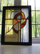
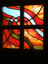
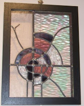
I finally settled on a fabulous piece of Youghiogheny glass in shades of green. The other glass that I selected was a ripple backed Uroboros art glass. The advantage of both of these glasses are that they are unique. In production they are hand ladled and hand mixed which means that even if the glass has the same code number, each sheet is different.
Another customer looked admiringly at the Youghiogheny glass and suggested that she would be tempted to 'put it in a frame just as it was'. I knew I had found the right piece.
It was with this in mind that I visited my favourite stained glass supplier at Tempsford. I had thought originally that I might use a very dark black baroque glass with a vibrant red glass as a contrast. It would make a mark and stand out from the crowd.
Baroque glass has the advantage of being textured in a swirly wave kind of way. The sort of glass that you would be tempted to touch and run your fingers over. A truly sensory glass. I had used this type of glass before in a previous project to great effect. During the assembly I had run my fingers over it and got down to eye level with it to ensure that the curves in the glass naturally followed on as in the original piece of glass. There had been no room for mistakes.
On discovering that the piece of glass that I had envisaged was not available, I had to have a major rethink. Fortunately I had taken a provisional cartoon with me. I spotted a beautiful piece of red patterned glass, but was unable to find another piece of glass that would suit both it and my design.
I finally settled on a fabulous piece of Youghiogheny glass in shades of green. The other glass that I selected was a ripple backed Uroboros art glass. The advantage of both of these glasses are that they are unique. In production they are hand ladled and hand mixed which means that even if the glass has the same code number, each sheet is different.
Another customer looked admiringly at the Youghiogheny glass and suggested that she would be tempted to 'put it in a frame just as it was'. I knew I had found the right piece.
Monday, 19 October 2009
A New Project

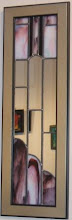
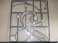
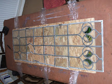
The cartoon for the new project is all drawn out.
Having experimented with several variations on a theme, I settled on a design. Scaling up always seems tricky, ensuring that the curves are exactly as you had intended them in the original drawing. After much rubbing out of lines and redrawing, I was finally satisfied. I coloured in the areas that were to be the accent colours and traced over the pencil markings with a thick felt tip pen.
Subscribe to:
Comments (Atom)