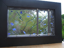
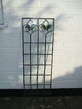
I had spent a very enjoyable time at Tempsford Stained Glass and had finally settled upon two pieces of glass.
Sorted then. Well... no. There were still decisions to be made. There were also the parameters that I had set myself for the design.
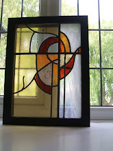
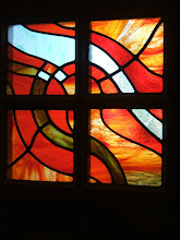
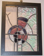
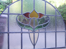
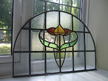
I wanted the colours and 'waves' in the glass to flow naturally in the finished piece. I needed to decide which part of the glass would best suit the flow of lines in my design. Youghiogheny glass has a waxy appearance. The part of the glass with the most waxy appearance was that part devoid of colour. I also wanted to make the most of the most dramatic part of the glass. There would be no margins for error.
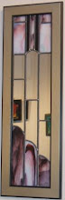
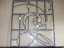
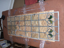
Also to consider was the texture of the glass. I want the finished design to be highly tactile. The texture on the reverse of the Youghiogheny glass was really interesting. However, the colours on the reverse were less vibrant. I needed to think carefully. Working on the reverse would have an implication for placement of the pattern pieces. In addition, I also needed to consider how I was going to use my Uruboros glass. The ripple backed glass was not going to be an easy cutting option. I had bought a larger piece of glass than I needed to take account of cutting errors. I still wanted the gradation of colour to appear natural in the shapes that I had highlighted for the second piece of glass. I spent a considerable amount of time with the glass and cartoon just exploring the options. Eventually the plan became clear.
Subscribe to:
Post Comments (Atom)

No comments:
Post a Comment